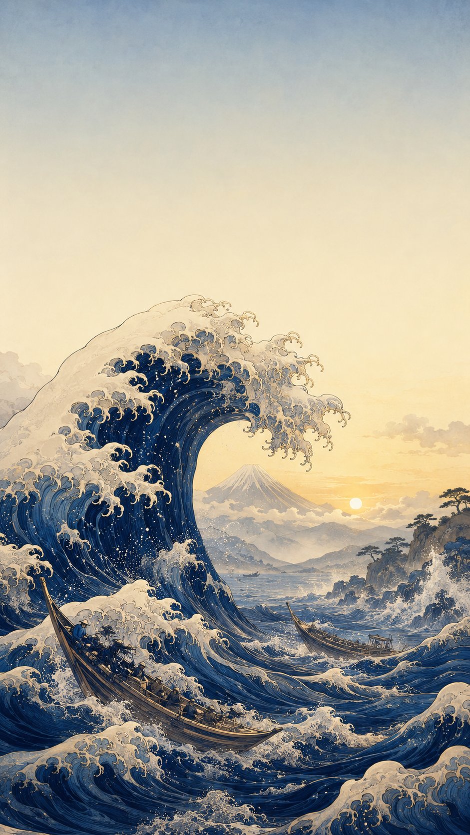
Painters often use warm colours to pull things forward and cool colours to push them back, creating depth on a flat surface.
Art technique
Why it matters
The idea in context
Red, orange and yellow often feel nearer or more energetic, while blue and green can feel more distant or calm, depending on context. Artists use this tendency with perspective, contrast and light. This matters in painting, film, interiors and app design. The lesson: colour is not decoration only; it organises space.
Türkçe
Aynı kart, başka bir dilde.
Ressamlar düz bir yüzeyde derinlik yaratmak için sıcak renkleri çoğu zaman öne, soğuk renkleri geriye iter gibi kullanır.
Kırmızı, turuncu ve sarı bağlama göre daha yakın ya da enerjik; mavi ve yeşil daha uzak ya da sakin hissedebilir. Sanatçılar bu eğilimi perspektif, kontrast ve ışıkla birlikte kullanır. Resimde, filmde, iç mekânda ve uygulama tasarımında renk yalnızca süs değil, mekânı düzenleyen bir araçtır.
Source trail
Read beyond the card.
Art technique
Background reading: ColorAttribution and context are revised when stronger evidence appears. Corrections are welcome through the editorial page.