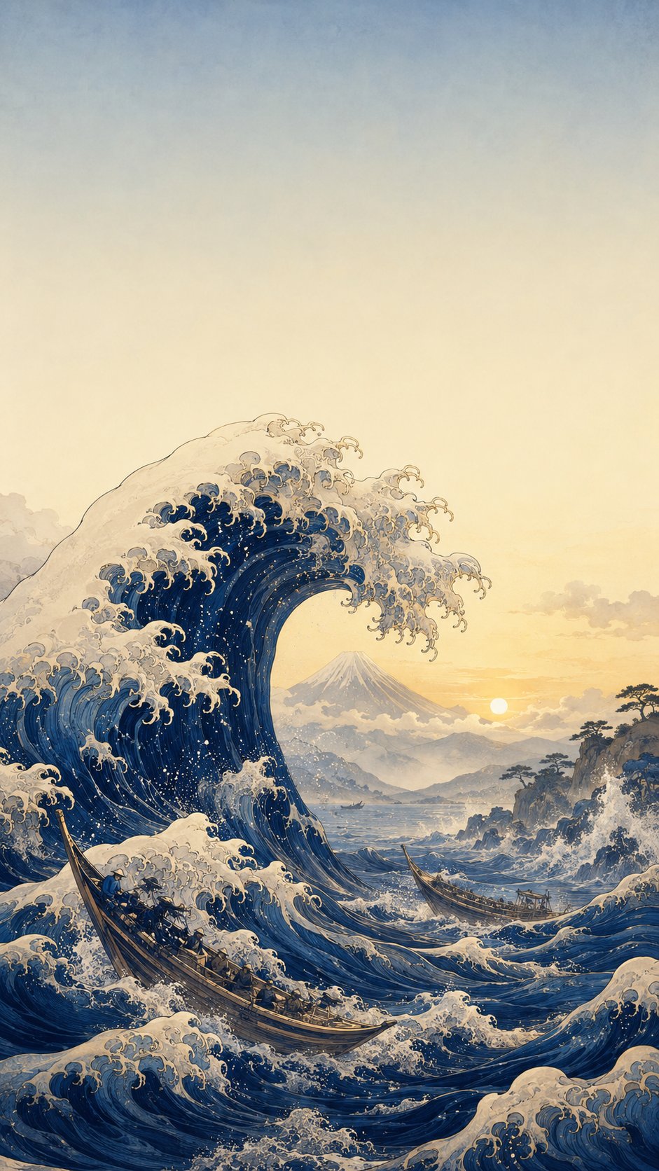
Colours opposite on the colour wheel, such as blue and orange, can intensify each other when placed side by side.
Art technique
Why it matters
The idea in context
Complementary colours create tension because the eye reads them against each other. Painters, designers and filmmakers use that tension to guide attention, sharpen mood or balance an image. Colour is relational: blue changes when orange stands beside it.
Türkçe
Aynı kart, başka bir dilde.
Renk çarkında karşıt olan mavi ve turuncu gibi renkler yan yana geldiklerinde birbirini güçlendirebilir.
Tamamlayıcı renkler gerilim yaratır, çünkü göz onları birbirine karşı okur. Ressamlar, tasarımcılar ve sinemacılar bu gerilimle dikkati yönlendirir, duyguyu keskinleştirir ya da görüntüyü dengeler. Renk ilişkiseldir: Mavi, yanında turuncu durduğunda değişir.
Source trail
Read beyond the card.
Colour theory.
Background reading: ColorAttribution and context are revised when stronger evidence appears. Corrections are welcome through the editorial page.